Case study
Hotel Booking App
Designing a smoother way to book your next stay. A new hotel booking system to ensure product-led growth by simplifying decision-making and removing friction across the booking journey.
Project goals
To create a hotel booking app that helps users easily find and book accommodation for holidays or trips.
My role
As the sole UX designer on this project, I led the research and design process from start to finish. I worked independently, but regularly sought feedback from mentors and peers to strengthen my thinking and iterate with intention. My mission? To dig deep into user needs and craft a booking experience that felt intuitive, seamless, and hopefully enjoyable!
Research & Discovery
Surveys
I used Google Forms with open-ended, multiple choice and ordinal scale questions to reach a wider demographic and gather insights on user habits, frustrations, and wish list features. This helped validate what I saw in usability tests, while uncovering broader patterns like price filters and clear photos being high priorities.
80%
of users wanted clearer photos
85%
of participants adjust the price range
80%
of participants use filters to search
Competitive benchmarking
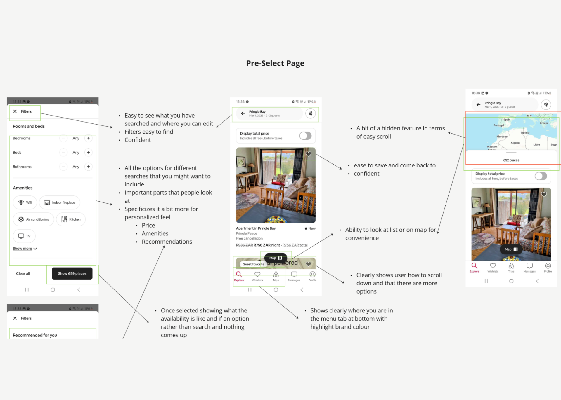
I reviewed 2 leading booking apps to understand industry standards, note clever solutions, and spot opportunities for improvement. Seeing how others solved similar problems helped me identify useful conventions to adopt and where I could do better.
Most weaknesses found were
- Too much information at wrong screens
- Back button functionality
- Ease of using the map
Some great strengths
- Clear CTAs
- Easy Filters
- User Focused & Recognition
Usability testing
Watching users interact with popular booking apps gave me a front-row seat to their frustrations and delight. From confusing calendar flows to surprising ease-of-use moments, these tests revealed which design patterns to avoid and which ones to build on. (Spoiler: date selection was a hot topic!). From these recorded usability tests, I created concise notes and broke down each task to understand pain points, behaviour and context.
Problem
A big issue was the calendar selecting process. Users struggled to work out how to start and end their trip dates. "Why has that only gone for 2 days?"
Solution
I made date selection intuitive and quick by highlighting the dates in one screen, reducing the number of taps and making it clear what was selected.
Personas
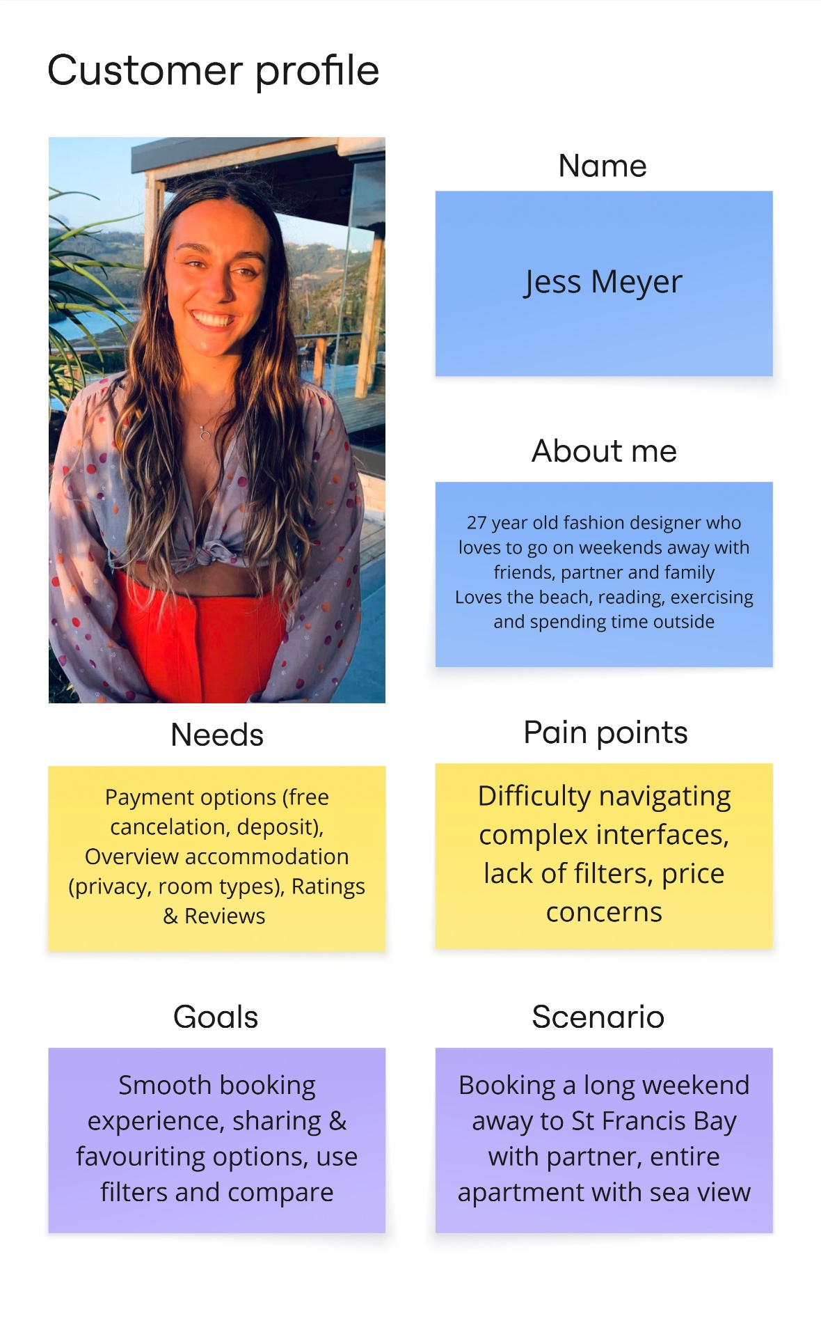
I wanted to form a deeper understanding of users' goals, needs, experiences, and behaviors, so I created a persona based on surveys and usability tests.
Customer journey
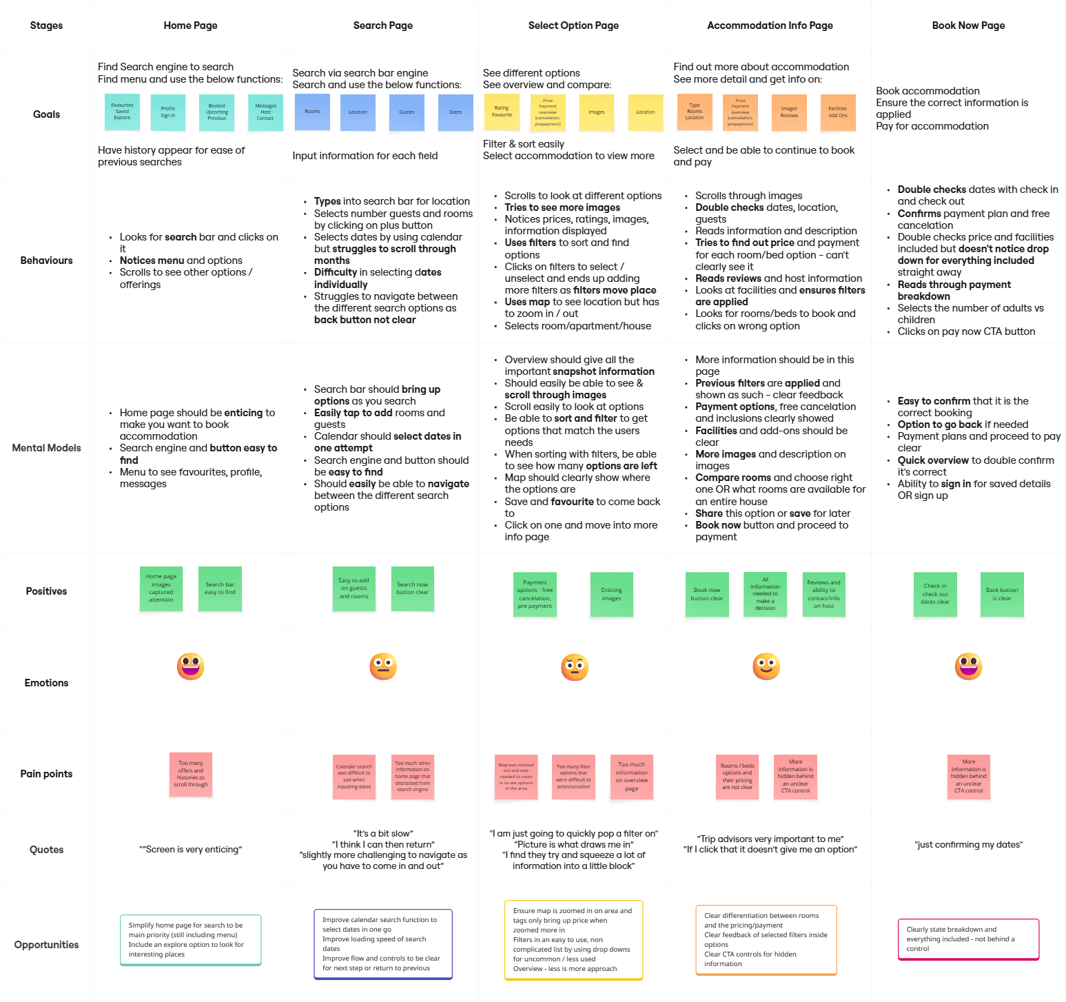
I created a customer journey map to build a better understanding of how customers find and interact with the service and to discover opportunities for improvement. Including thoughts, emotions, and potential pain points helped me empathise deeply and spot areas where a better experience could really shine. Those ideas I said were constantly spinning in my head, came into focus here. How and where I could incorporate my ideas and better functionality.
Card sorting & affinity mapping
To make sense of all the raw research, I hosted a mini online workshop. Using Miro, we collated the research and sorted themes and patterns into logical groups, which shaped the structure of the app. We spent a lot of time debating and countering our ideas, finally coming to a conclusion that joined all our patterns.
After organizing the data, we ended up with 4 clearly defined main categories with 4–5 subcategories in each. Collaborating on this helped me spot blind spots I might've missed solo as well as challenging my view points, making me think and look at the task differently.
Ideas & Insights
User flow
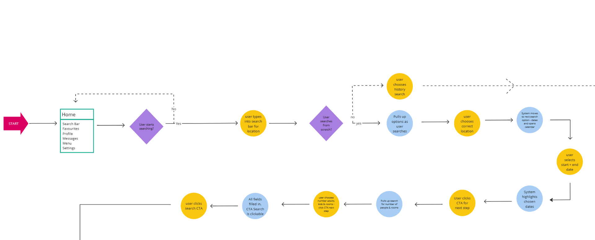
With my research in hand, I mapped out the user flow. Starting with a straightforward booking journey and considering any alternate paths (like changing dates or filtering results). This became the skeleton of the app.
Mapping this journey revealed key parts of feedback, CTAs and where different screens need to interact such as selecting the map or being able to adjust the calendar search. It also helped to create a clean, comprehensive pathway with as little resistance as possible. A big part of this that was missed was being signed in or not as well as continually having the CTA to book a spot.
Design & Validate
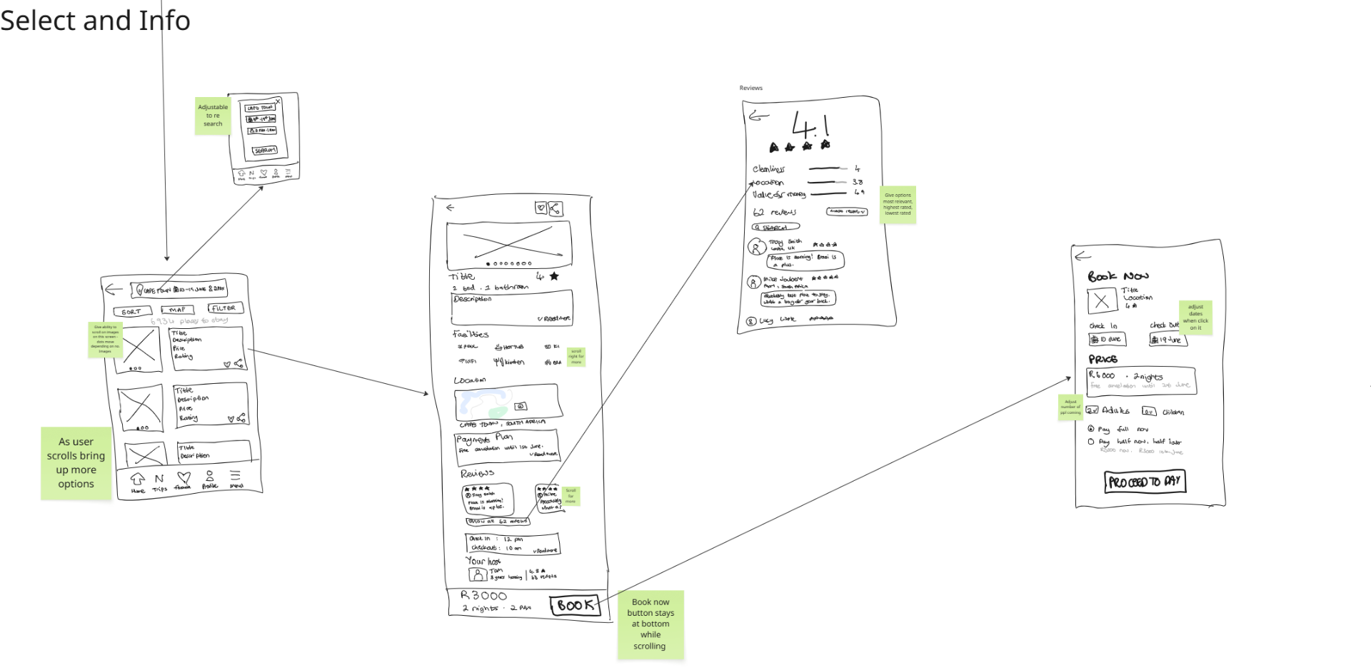
Sketches & wireframes
Then came the fun part: low-fidelity sketching! I moved back and forth between flows and mockups, letting ideas evolve as I reviewed my research. My main purpose was to create screens and outlines that bought all the research together. Iteration was constant… I'd sketch, tweak the flow, sketch again. Adding sticky notes helped me remember key ideas/flows, as well highlighting to differentiate between "clicks".
Only once things felt right did I move from Miro with my pen into Figma to start creating high-fidelity wireframes.
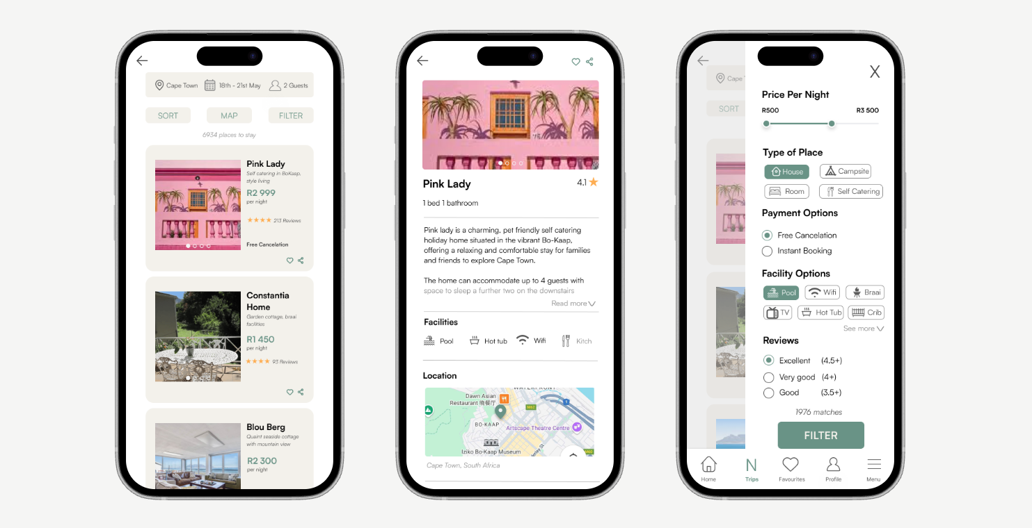
UI design
I used a clear, fresh and light visual style that incorporated greens for peace — making the user feel calm and ready for holiday when booking accommodation. Clear CTAs with icons and wording to allows for ease in differentiation and clear feedback on where one needs to go.
Prototype & Annotate
With visual design in place, I brought the app to life using Figma's prototyping tools. This step let me feel the user journey by tapping through screens, catching friction points, and spotting new opportunities for delight.
Every interaction was tested, tweaked, and then documented with comments for developers. I made sure to include edge cases and moments that sit outside the "ideal" flow because real users rarely follow a perfect path.
Try it out →Get in touch
Drop me a message
Have a project in mind or want to chat about the work? I'd love to hear from you.
Say hello →Read more of my case studies
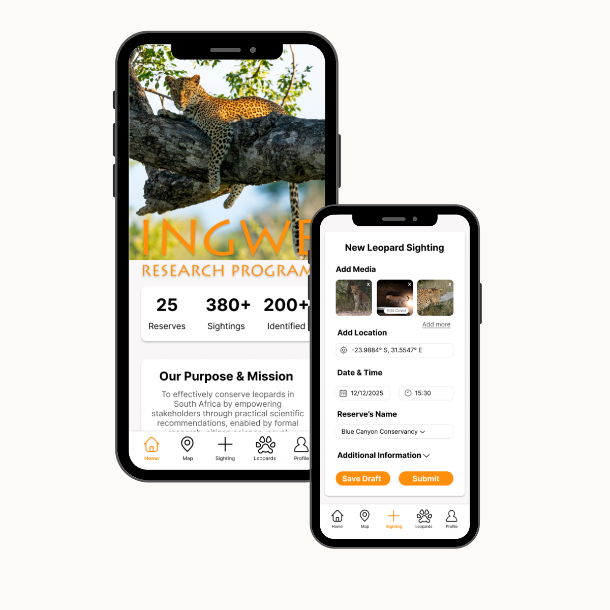
Next case study
Leopard Sighting App
Designing a simpler way to log leopard sightings — so every upload supports conservation in Southern Africa. Redesigning the sighting upload experience so more citizens and field teams could contribute sightings with confidence.
View case study→