Case study
Leopard Sighting App
Designing a simpler way to log leopard sightings — so every upload supports conservation in Southern Africa. Redesigning the sighting upload experience so more citizens and field teams could contribute sightings with confidence.
Overview
Ingwe Leopard Research is a conservation non-profit supporting people across Southern Africa to upload leopard sightings. Researchers then log, identify, and track individual animals over time. The first version of the app proved the concept but the upload experience felt limited and unintuitive. I stepped in as the sole UX/UI designer to redesign the experience end-to-end, building on top of the developer's initial implementation.
This project carried real weight (and incorporated a passion of mine). Every abandoned upload meant a lost data point, and lost data slows conservation decisions. The focus was simple: make uploads easier, clearer, and more rewarding so participation could grow alongside the research.
Goals
Ingwe's goal is to increase both the number of sightings submitted and the number of citizens contributing. For that to happen, the upload experience needed to feel simple, fast, and worthwhile. At the same time, conservation teams and game reserves require reliable tracking and sighting history to support research and management decisions.
The redesign focused on:
- Removing friction from uploads
- Creating a clear history view of past sightings
- Allowing local reserve teams access to sightings in their areas
- Encouraging repeat contributions using gamification features, since frequent sightings significantly increase dataset value
Success looks like more completed uploads, stronger image and data quality per sighting, and improved collaboration between teams tracking leopards.
Brief and Interview
Surveys
To better understand where users were struggling, I created a short survey targeting citizen contributors, reserve owners, guides, and volunteer groups. The questions focused on upload effort, comfort with sharing location data, what motivates contribution, and what users gain personally from submitting sightings.
The findings helped prioritise improvements that would directly impact completion rates; especially draft saving, feedback visibility, and identification support. It became clear that users weren't just uploading information, they wanted reassurance that their contribution made a difference.
69%
of respondents wanted clearer feedback and visibility of past sightings.
46%
were unsure how impactful their sightings were.
39%
would like an identification and ID kit of the sighted leopard.
Research & Discovery
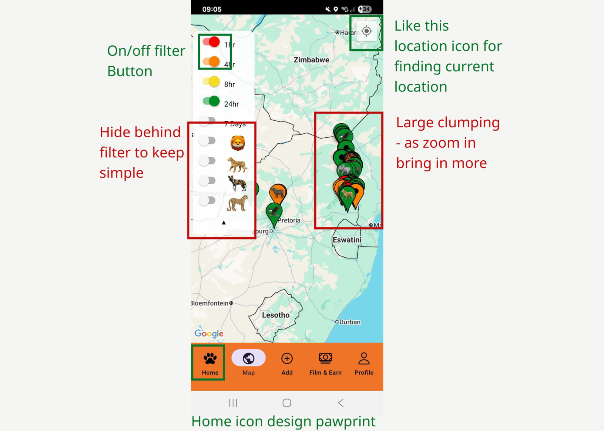
Benchmarking research
I conducted competitive benchmarking across three wildlife and plant logging platforms to understand common patterns in onboarding, map interactions, permissions, and sighting uploads.
Strong patterns: clear feedback loops, visible filters, recognisable icons and top-line design patterns, intuitive location finding.
Weak areas often lacked: clear validation, strong upload affordances, well-placed filtering controls.
These insights guided the redesign toward clarity and simplicity, ensuring users always knew their next step.
User flow & journey
With the goals in mind, I made sure that users reach the final screen. With the goals defined, I mapped out the upload journey across different scenarios including logged in vs logged out states, draft saves, filter adjustments, and varying access levels.
A key discussion point was permissions: what contributors, reserve teams, and researchers could view or manage. This led to a structured access-level document and several iterations to ensure visibility aligned with conservation needs while remaining intuitive for users.
Mapping the flow helped surface edge cases early and ensured users could move from start to submission without unnecessary friction.
Ideas & Design
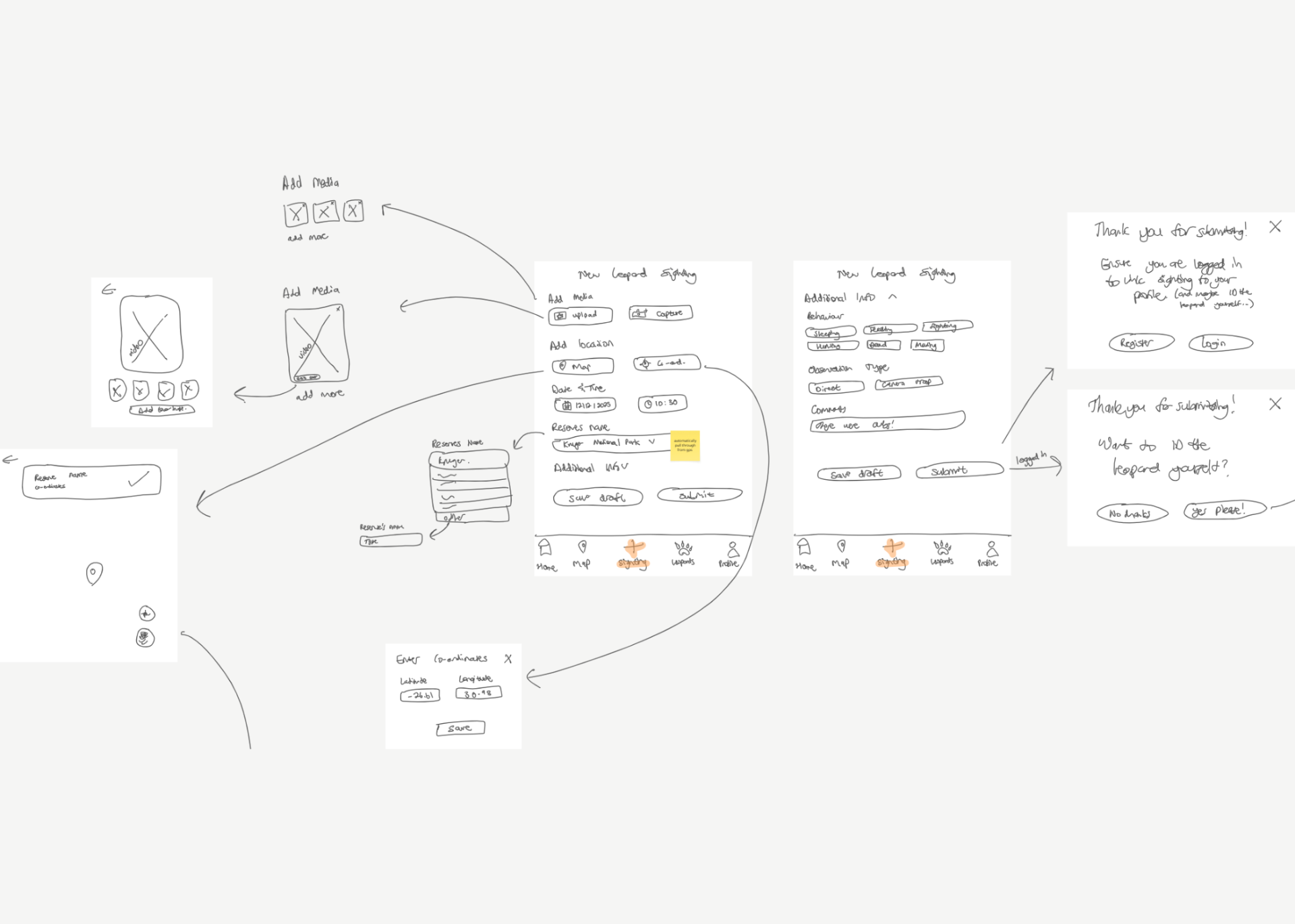
Sketches & wireframes
I began with low-fidelity sketches to explore the structure of the main areas: Home, Map, Sighting, Leopards, and Profile.
As I moved between research and layout, I continuously adjusted (more like draw, erase, leave notes, repeat) hierarchy, required fields, and error states making sure each screen supported the critical path:
Add photos → Add details → Submit → Confirmation → What happens next.
These wireframes grounded conversations with the owner and developer, translating ideas into practical layouts that could move confidently into UI design and development.
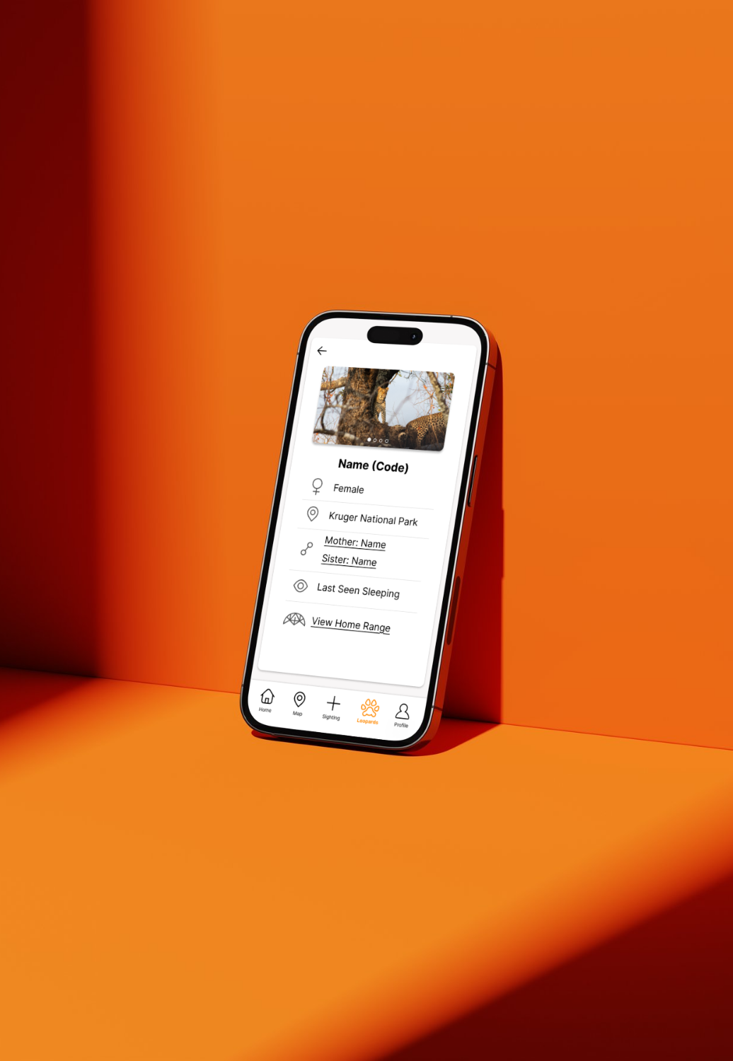
UI design
The final interface used Ingwe's bold orange brand colour paired with high-contrast typography for readability outdoors and in bright conditions. I prioritised:
- Large tap targets for easy uploads
- Clear grouping of information
- Obvious filtering controls
- Easy access to past sightings and identified leopards
Gamification elements were introduced thoughtfully, not as decoration, but as a way to encourage continued participation and reinforce the value of each contribution. The aim was not just usability, but engagement.
Follow the prototype yourself! Let's Go →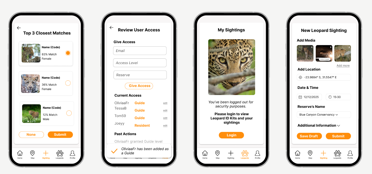
Testing & Improvements
Phase 1 rollout is currently underway, with initial testing taking place in the field. As real users begin interacting with the updated experience, new learnings are emerging. These insights will inform the next round of refinements and improvements, ensuring the app continues to evolve alongside the needs of contributors and conservation teams.
Get in touch
Drop me a message
Have a project in mind or want to chat about the work? I'd love to hear from you.
Say hello →Read more of my case studies
Next case study
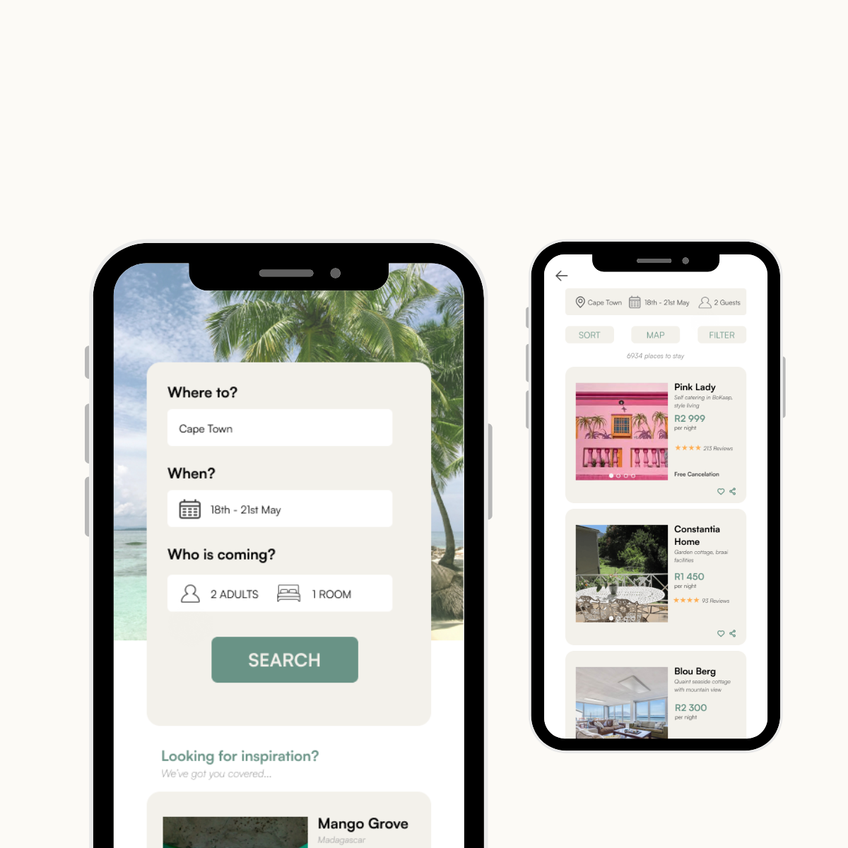
Hotel Booking App
Designing a smoother way to book your next stay. A new hotel booking system to ensure product-led growth by simplifying decision-making and removing friction across the booking journey.
View case study→